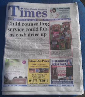
One of the first aspects you notice when you look at the front cover is the advertising that runs along the bottom of the page. This seems to be a mainstay in local magazines with adverting running along the bottom of the page for the additional income needed to afford to publish the newspaper. The advertisements are likely to be placed around the bottom of the page due to the content being the first thing you read on the page which is limits the detraction of the reader. Another aspect similar to the post is the head banner at the top which consists of the data some additional info to the right with a bar running along underneath the title. The issue number and the price is normally within this banner and within the example within the bar is some references with page numbers of content. The colours of the newpaper also shares its similarities to the Bristol Post with its similar colour scheme with blue the main additional colour used which is important as it needs to be simplistic and neutral. The website is also advertised on the front page at the bottom this shows that most newspapers will advertise and have an external website for an extra source of information. The content is very much focussed on the events of the community with several stories such as 'arson' which relates to the local area with 'child counselling' featuring as the main story this strengthens the link with the concerns of the family and how they will be effected due to certain events meeting the interests of the audience of a local newspaper.
Here is the first two pages of the same edition of the newspaper to help show what my second page could look like. The stories you notice immediately when you look at the first few pages is the minor stories and headlines to what you may be accustomed to with the national or even a bigger regional newspaper.


No comments:
Post a Comment