SMITH & SONS was one of the advertisements that I planned to make before going into the creation stage of the project. I have created a sketch of what it would look like and also stated that it will be wholly created by me on Photoshop with a simplistic design. The first step was making sure that the dimensions for the advert that I would create would be the same dimensions that I had assigned to my advert on the layout that I previously designed.
One of the most important things I did was the manipulation of layers which was important with the many parts like the glass on this window needing to be arranged to be placed at the front. The window was easily made by using the rectangle tool to create the shape then rotating the shape. I also used the shadow effect on the window to make an almost 3D effect.
The next part of the process was drawing out the outline of the van show off its vague figure, I did this through the use of the pen tool as it allows you to make a freeform shape. I later added some of the other parts of how a van looks such as the wheels, the window and the lines you see on a van. This gives the overall look of the van as identifiable while also looking simplistic. I also added a shadow effect to the van at a similar gradient for the same reason as the window. The final task was to add the complimentary text and the advert was complete.
Tuesday, 22 October 2013
Theft Story Photos
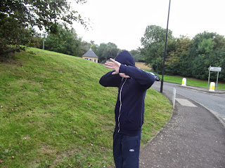
Above are the three pictures I had taken that I later edited and inserted into my second page article on a criminal committing thievery. I did take some other photos while I was taking the pictures but, these are the ones I selected to go in my second page article. The first two images I later edited to make it look like it was taken from a CCTV camera which is why I took the images from above looking down on the culprit as a real CCTV camera would with both being roughly in the same position that I improved during the editing phase. I also made sure that it overlooked some of the house so it looks like it is attached to the wall. The third photo I used was of the culprit walking out of the police station while covering his face as many usually do so the press can't take a picture of them. This is to show that he has been caught, the clothing that I used was trackies with houudies with the hood pulled up which is the standard stereotype for a chav which most people perceive to be more likely to steal.
Tuesday, 15 October 2013
Layout Creation


The first step in the creation of my main product, the newspaper, was creating a basic layout on how the pages will look like. I used boxes to help represent what goes where helping to show where the imagery and the text that I will create in the future will go. As well as the layout you get an idea of how the page will looks with much of the complimentary colours and head banners used. All of this was created on A4 to begin with before I changed the dimensions to almost a A3 size that is more similar to the size of an actual newspaper. It was simple to move on to as it was easy to resize everything on the page. All of the components were easy to manipulate as they were set on different layers. The design has altered slightly as I carried on with the creation of the product but has not changed much from the original design shown here.
Subscribe to:
Comments (Atom)
+JPEG.jpg)


